

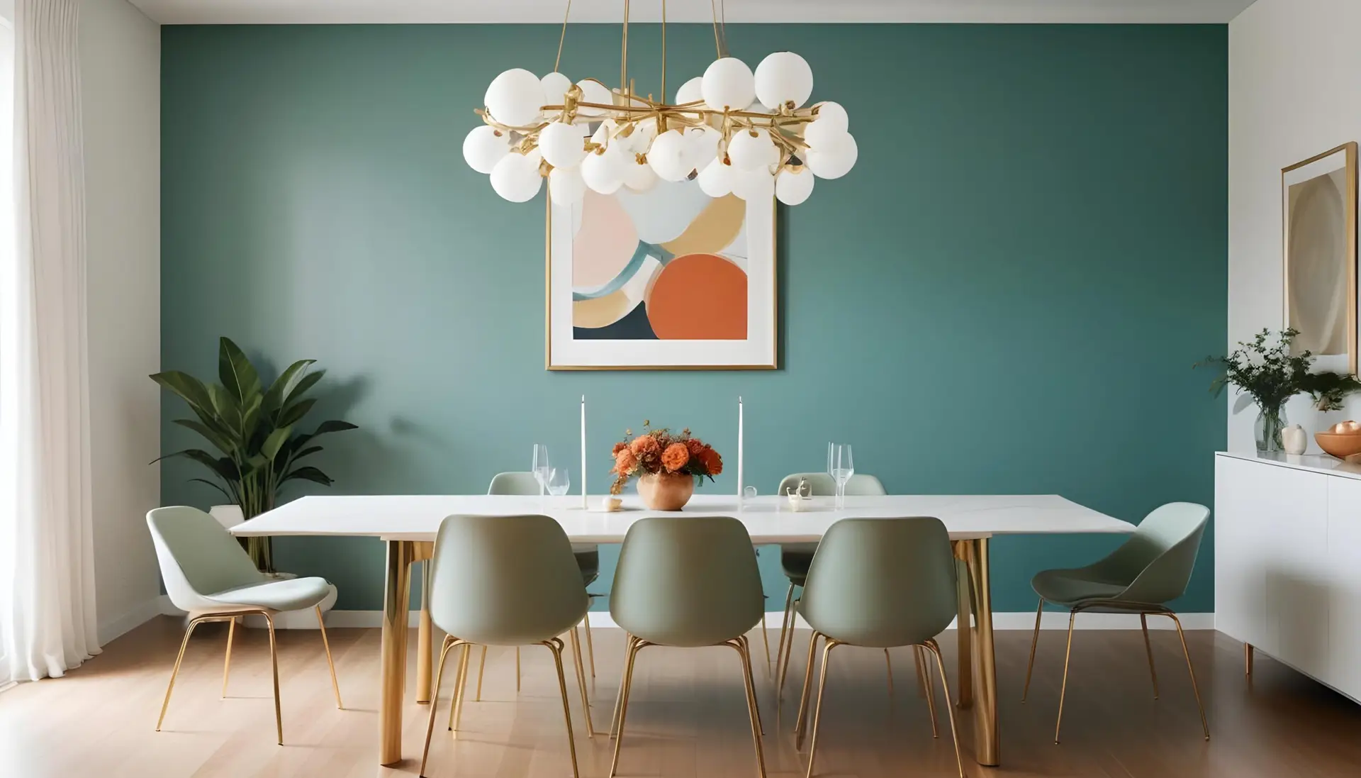
The dining room is more than just a place to eat; it’s a dedicated space for gathering, celebrating, and deep conversation. Unlike other rooms in the home, the dining room often benefits from colors that create drama, intimacy, or a sense of occasion. Choosing the right wall paint can completely define the atmosphere and highlight your furniture and art.
Choosing the Right Mood for a Dining Room
Before selecting a color, determine the primary function and desired feeling of the space.
Cozy and Warm Gathering Space
If your dining room is primarily used for intimate family dinners or long, conversational gatherings, the colors should feel enveloping and soft.
- Color Palette: Lean towards deep earth tones, muted oranges, terracottas, or soft, dark reds (like burgundy or oxblood). These warm tones are known to stimulate conversation and appetite.
- Effect: Creates an intimate, inviting environment that feels like a comfortable retreat.
Elegant, Formal Dining Area
For spaces reserved for holidays, formal parties, or upscale entertaining, the goal is sophistication and drama.
- Color Palette: Jewel tones—deep sapphire blue, rich emerald green, or charcoal gray—work exceptionally well. These colors serve as a stunning, high-contrast backdrop for formal china, crystal, and silver.
- Effect: Imparts a luxurious, refined atmosphere that emphasizes high ceilings and architectural trim.
Fresh and Airy Casual Dining
If the dining area is integrated into an open-concept living space or used daily for breakfast and quick meals, a light, invigorating palette is best.
- Color Palette: Soft whites, very pale grays, light greens (like seafoam or mint), or sunny yellows.
- Effect: Maximizes natural light, makes the space feel expansive and clean, and seamlessly connects to adjacent rooms.
Popular Dining Room Paint Color Ideas
These colors are current favorites in US interior design for their ability to deliver high impact and lasting appeal.
Deep Navy or Charcoal for Drama
Deep hues immediately command attention and are incredibly versatile.
- Why it Works: Dark colors recede, making the room feel cozy and allowing metallic accents (like chandelier finishes or framed artwork) to truly pop.
- Usage: Pair deep navy walls with crisp white crown molding and baseboards for a classic nautical-meets-formal look. Charcoal is a sophisticated neutral that pairs well with every wood tone.
Warm Neutrals (Beige, Taupe, Greige)
Neutrals are timeless, particularly when chosen with warmth. These are excellent choices for open-concept homes where flow is essential.
- Why it Works: They are flexible enough to transition easily between a kitchen and living area. Warm neutrals create a soft glow under both natural light and artificial evening light.
- Tip: Look for neutrals with yellow or red undertones to keep the room from looking sterile or cool.
Bold Accent Walls (Emerald, Terracotta, Burgundy)
An accent wall is a great option if you want a bold color but fear overwhelming the space.
- Placement: The accent wall should typically be the one least interrupted by doors or windows, often the wall behind a significant piece of furniture like a buffet or hutch.
- Color Choices: Emerald green is a favorite for its regal feel, while deep burgundy and terracotta add European warmth.
Classic White with Contrast Trim
While often seen as simple, white dining rooms can be incredibly sophisticated when texture and sheen are used.
- Why it Works: A simple white allows expensive textiles, large rugs, and statement light fixtures to be the focus.
- Tip: Use a soft, warm white on the walls (flat finish) and paint the trim (wainscoting, crown) in a slightly cleaner, semi-gloss white for subtle dimension and easy cleaning.
Design Concepts That Elevate Dining Rooms
Go beyond four flat walls by incorporating architectural paint techniques.
Two-Toned Walls
Painting the wall in two distinct horizontal sections adds visual interest and formality.
- Technique: Traditionally, the darker, richer color is applied below a chair rail (or in the bottom third of the wall), with a lighter, often neutral color above.
- Result: This technique grounds the room, creates depth, and draws the eye up, emphasizing ceiling height.
Painted Wainscoting
If your dining room has beadboard, picture frame, or raised panel wainscoting, you have a perfect opportunity for contrast.
- Option 1 (Traditional): Paint the wainscoting the same crisp white as your trim, and paint the wall above a bold color (like a deep blue).
- Option 2 (Modern): Paint the wainscoting a slightly darker neutral or gray than the wall color above it, creating a sophisticated tonal shift.
Color Drenching (Walls + Trim Same Color)
This ultra-modern approach involves painting all elements—walls, trim, and sometimes the ceiling—the same color.
- Technique: To avoid a flat, one-dimensional look, use a different sheen on the trim (Semi-Gloss) than on the walls (Flat or Eggshell). The light reflectivity defines the architectural features.
- Result: Creates an intentional, cozy, and immersive experience that feels custom and high-end.
Pairing Wall Colors with Furniture & Lighting
A successful dining room color scheme is one that complements the permanent fixtures in the room.
Complementing Wood Tones
- Warm Woods (e.g., Cherry, Mahogany, Red Oak): Pair these with warm wall colors (taupe, sage green, cream) to enhance the wood’s richness.
- Cool Woods (e.g., Ash, Whitewashed Oak, Dark Walnut): These are best complemented by cool or gray-based wall colors (cool gray, deep sapphire, crisp white) to create contrast.
Matching Lighting Warmth with Paint Undertones
Artificial light dramatically affects paint color.
- Warm Lighting (2700K – 3000K LEDs): This common warm white light enhances warm-toned paints (reds, yellows, beiges). Ensure your chosen paint doesn’t look too yellow under this light.
- Cool Lighting (4000K+): Cooler, bluer light tends to sharpen cool-toned paints (blues, greens, purples) but can make warm colors look muddy or drab.
Coordinating with Décor and Textiles
The wall color should act as a sophisticated background for your existing textiles. Ensure the paint doesn’t clash with the largest fabric pieces, such as your area rug or dining chair upholstery. Use a color wheel to ensure your wall color either complements (sits opposite) or harmonizes (sits adjacent) with your primary accent fabric colors.
FAQs
“Should the dining room match the kitchen?”
Not necessarily, but they must complement each other, especially in open-concept homes. You should aim for color continuity, meaning the colors should share the same undertone (e.g., both spaces use colors with a warm, creamy undertone). In closed dining rooms, you have complete freedom to use a dramatically different color palette.
“Which colors make dining rooms feel bigger?”
Any color that is light and reflective will make a room feel bigger.
- Light, Cool Colors: Pale blues and light grays are known to visually push walls away from the viewer.
- Monochromatic Walls and Trim: By blurring the edges between the walls and trim, the eye doesn’t stop, which tricks the brain into perceiving a larger space.
- High-Sheen Ceilings: Using a semi-gloss or high-gloss paint on the ceiling (or on the upper half of a two-toned wall) can reflect light and heighten the room.
“What colors feel more luxurious?”
Luxury in a dining room comes from depth and richness.
- Jewel Tones: Deep emerald, sapphire, and amethyst.
- Highly Saturated Dark Colors: Charcoal, black, and deep forest green.
- Tonal Layers: Using a single, deep color on both the walls and the ceiling (or on a texture like plaster) creates a layered, custom, and luxurious feel. Always pair these colors with metallic accents (gold, brass) for the final touch.
Are you ready to transform your dining room from functional to fantastic?
Contact Deluxe General Services today. Our expert team provides professional color consultation, precise surface preparation, and flawless application to bring your vision of an elegant, memorable dining space to life.