

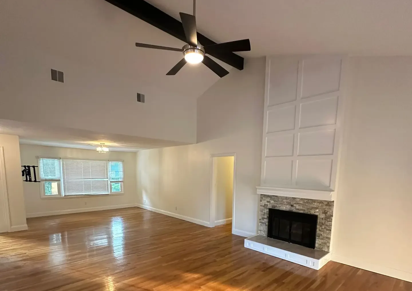
Choosing the right paint color is one of the most transformative decisions you can make for your home. It’s more than just a shade—it’s the foundation of a room’s mood, the complement to your furnishings, and a reflection of your personal style. This comprehensive guide, brought to you by Deluxe General Services, breaks down the steps to selecting the perfect palette.
Define the Mood and Purpose of the Room
Before you look at a single swatch, determine the function of the room and the emotional experience you want to create within that space.
Bedrooms, Living Rooms, Kitchens: Different Intentions
- Bedrooms: Spaces for rest and relaxation require calming colors. Think soft, muted tones like dusty blues, pale greens, or warm, subtle grays. Avoid overly stimulating or vibrant colors that interfere with sleep.
- Living Rooms: These are highly social and flexible spaces. Colors should be inviting and reflective of your entertaining style. Warmer neutrals (creams, taupes) promote conversation, while balanced blues and greens can feel refreshing and sophisticated.
- Kitchens: Often the busiest part of the home, kitchens benefit from clean, energetic colors. Crisp whites and light grays are popular for promoting a clean feel, while bold accent colors (navy, forest green) can be used on islands or lower cabinets to ground the space.
Color Psychology Basics
Color psychology suggests that different hues can evoke specific emotional and psychological responses:
- Blue: Calming, peaceful, and intellectual. Great for offices and bedrooms.
- Yellow: Optimistic, cheerful, and energetic. Best used sparingly in small doses or as a warm, buttery neutral.
- Green: Relaxing, restorative, and natural. Excellent for bathrooms and sunrooms.
- Red/Orange: Stimulating, passionate, and appetite-inducing. Often used as accents in dining rooms.
Understanding Undertones and Lighting
Undertones and lighting are the two most critical factors that determine how a color actually looks on your wall versus how it appears on a paint chip.
Warm vs. Cool Undertones
Every paint color is composed of a base pigment. A gray paint, for instance, might have a cool undertone (blue, green, or violet) making it feel crisp and modern, or a warm undertone (red, orange, or yellow) making it feel cozy and earthy. If your warm-toned flooring clashes with a cool-toned wall paint, the entire room can feel disjointed.
How Natural and Artificial Light Affect Color Perception
Light is the single greatest variable in color perception:
- Northern Light: Brings cool, bluish light that is consistent throughout the day. This light tends to make colors appear duller and enhances cool undertones.
- Southern Light: Provides bright, warm, and yellow light. This light can wash out pale colors and intensify warm undertones.
- Eastern Light: Bright and warm in the morning, shifting to cool gray in the afternoon.
- Western Light: Cool in the morning, becoming intensely warm and orange/red in the late afternoon.
- Artificial Light: Test your chosen color under the specific light bulbs you use (e.g., 2700K warm LEDs vs. 4000K neutral LEDs), as this light source will dominate in the evenings.
Consider Your Fixed Elements: Flooring, Furniture, and Trim
Your paint color must harmonize with the elements you are not changing. These “fixed elements” provide the boundaries for your color choices.
How to Coordinate with Existing Materials
- Flooring: Look at the undertones in your wood, tile, or carpet. A dark cherry floor (red/warm undertone) typically pairs best with wall colors that have neutral or warm undertones (like greige), rather than stark blues or greens.
- Countertops/Cabinetry: In kitchens, your wall color must complement your cabinetry finish and countertop material. Pull out a subtle hue from a patterned granite or marble countertop to use on the walls for cohesion.
- Trim: The color of your window and door trim (usually a bright white or an antique cream) sets a baseline. Ensure your wall color works with the trim; a very gray wall might make creamy trim look yellow, and vice versa.
Popular Interior Paint Color Palettes and Trends
While personal taste should always govern your choices, understanding current palettes can help you achieve a cohesive and timeless design.
Neutrals, Accent Walls, Bold vs. Subtle
- The Reign of Warm Neutrals: The shift away from stark, cool grays continues. Warmer neutrals, often dubbed “greige” (gray-beige) or “mushroom,” are popular because they adapt beautifully to different light sources and prevent spaces from feeling cold.
- Accent Walls: Used to define a zone (like a dining area or behind a bed), a single accent wall in a deep jewel tone (emerald, sapphire) or a rich black can add drama without overwhelming the entire space.
- Subtle Color: Using pale, washed-out versions of traditional colors (e.g., sage green instead of emerald) provides color without sacrificing the light, airy feel of a neutral palette.
Regional Style Considerations (Greater Boston / New England)
In regions like Greater Boston and New England, many homes feature historic millwork, Colonial or Victorian architectural details, and periods of intense sunlight followed by long, gray winters.
- Deep, Historic Hues: Embrace the traditional architecture by using rich, saturated colors in less-frequently used rooms, such as deep navy, hunter green, or historic maroon in a library or dining room.
- Crisp Whites and Creams: For living spaces and entryways, use creamy, historic whites or off-whites that complement dark wood flooring and traditional moldings, helping the details of the architecture stand out.
Testing Colors and Avoiding Costly Mistakes
Never commit to a color based solely on a small paint chip. Testing is the critical final step to ensure satisfaction.
Sample Swatches, Real-Time Lighting Tests
Purchase pint-sized samples of your top 3 to 5 colors. Do not paint directly onto the wall; instead, paint large swatches (at least 2′ x 2′) onto poster board.
- Mount the Swatch: Tape the painted poster board to the wall in the desired room.
- Move the Swatch: Move the swatch to different walls (near windows, in corners) to see how the light hits it.
- Test Over Time: Observe the color at different times of the day—morning sun, midday, and under the light of your artificial fixtures at night.
Using Apps or Digital Visualizers
Many major paint manufacturers offer apps or websites that allow you to virtually “paint” a photo of your room with different colors. While these are great tools for initial filtering and seeing color pairings, they should never replace the physical testing of real paint swatches on your wall.
FAQs
“Should all rooms match the same palette?”
No. While a cohesive flow is recommended, every room does not need to match. Use color to define spaces. For a pleasing transition, ensure the colors in adjoining rooms share similar undertones (e.g., all warm-toned or all cool-toned) or use a neutral transitional color in hallways and entryways.
“What colors increase resale appeal?”
Generally, neutral, non-polarizing colors offer the best resale appeal. Think light grays, warm whites, and soft greiges. These colors allow potential buyers to easily envision their own furniture and style in the space without feeling the need to immediately repaint.
“How many samples should I test?”
You should test at least three to five of your top contenders. Start with your favorite and two similar shades (one slightly lighter, one slightly darker). Also test a completely different option for comparison. It is far cheaper to spend $50 on samples than $500 on repainting a poorly chosen color.
Ready to bring your vision to life?
Choosing the right paint is a big step, but the preparation and application require professional expertise. As a full-service home improvement provider, Deluxe General Services offers color consulting and expert, flawless painting execution.
Contact Deluxe General Services today to book your consultation and painting service!